I do think I still have a bit to go to get to where I want to be, I do not believe that finalizing before the final deadline will be an issue.
For my portfolio, I wanted to try something new this semester. All of my previous portfolios have been supporting my illustrations that I would create. However, I realized I spent more time on making the websites pretty rather than using design to support the content and I usually ended up having a lot of trouble fully completing the portfolio if not completely failing in completing the portfolio in the end. For this round, I want to focus on the design and production of the portfolio so for my theming I wanted to go with something that I could easily have pictures for or center a design around. After a bit of thought, I decided to go with a portfolio themed around my rats. I started with an initial moodboard of some ideas I could use, including pictures of the rats, website inspiration, layout ideas, and general ideas to try to get a clearer picture of the direction I wanted to go with. A lot of this work is just me putting lots of ideas down and trying to see what is going to work. I decided that while I liked a lot of the themes and colours I was putting down, they did not entirely match the references I was looking at for websites. The colours I was choosing were also incredibly muted and ended up blending with and washing out the rats. After showing not only the original colour ideas, but some warmer tones I tried on the right to some people it was generally agreed upon that the whole palette felt washed out.
From there I decided to work on a clearer stylescape that accentuated the warm palette I wanted to go for, while still trying to make the rats be able to stand out. I ended up so far with this stylescape, with only a few minor things being changed between this version and the first. I use the warm oranges and yellows to help keep everything bright and vibrant, while using the blues to help balance the overall palette. I also worked on testing a few different fonts- three for the title and two for the regular text. I ended up deciding on Bevan and Open Sans, however Open Sans is done in a bolder font then the one currently in the stylescape as it is currently not readable. Lastly, there is a border around the rat doodles that will outline the page as well as the rat pictures themselves. This is because in the way I wanted to design the portfolio, the pictures looked a bit out of place against all the different colours, however I got the advice from Chris to try adding a border to make them look like stickers being put into the portfolio which I absolutely adored as an idea. It also adds some visual similarity between the illustrations and the pictures, as I can make everything end up looking like stickers.
In between both the mood board and stylescape, I decided to make some quick mockups sketches of the homepage just to make sure my ideas could work. It also gave me a clearer vision while working on what I was aiming to create. A major problem I have with these as they feel very empty, like things are placed without purpose. I also found through this I do need to be careful about how I go about sizing the rat pictures as even if they are generally the same size pictures, one rat can look bigger or smaller depending on how I size them on the page. I also need to be more methodical on where and how I use colours and create a guide for myself on where to use what- As again, things are being put wherever at the moment with no rhyme or reason.
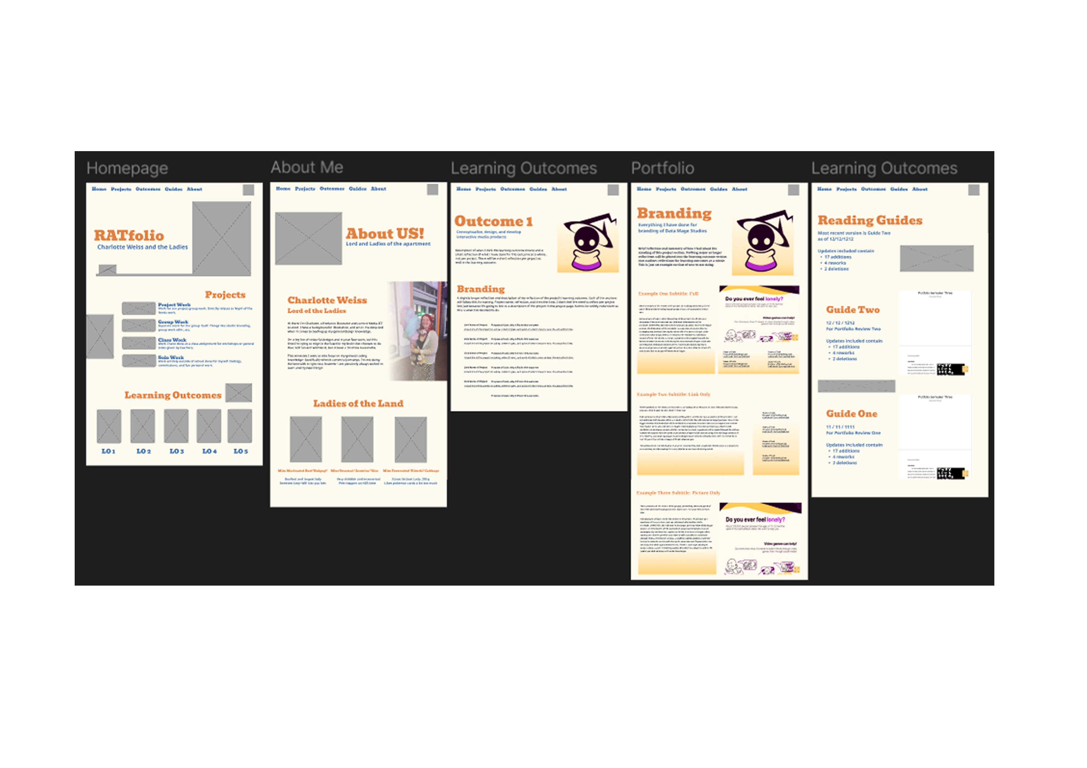
I then moved onto wireframes. I kept in mind the sizing of everything, as well as the visual hierarchy of information as much as possible. Each page counts as one page on the website, however I split up the page into coloured sections to determined how much space information would take up on an average sized monitor of 16:9. I personally do not like websites that try and store too much information per ‘viewable’ section at a time. A big example for me is youtube when you play a video. It shows you what I consider to be the perfect amount of information at a time considering what the goal of youtube is as a way to have you endlessly watch and scroll through videos. For example on this video- It shows the home bar with a search function, and general home bar information, then the video, one recommended video, some shorts it wants you to see, and then a select bit of information about the video itself. I tried to section information thinking of not only youtube, but other websites I kept in mind during the process. From this I created the main pages of my portfolio. Each one shows a basic layout of each section- and for the project specific page it also shows the three different sections that can be seen based on if a project section has images, links, or both. I also tested two different homepages with advice and feedback from Jan on how to structure the Learning Outcome section. I ended up going with the second one as it best showed the information without the page feeling cramped or overwhelming. I also ended up getting rid of the box behind the learning outcome buttons just because even if it was meant to be a picture it would overlap too much with the information and overall cramp the page.
I have now moved on to designing the actual look of the pages. I am starting off with the light mode of the page, as from here on I can already start coding the page layout as long as I have the look of a single version of the page. I can then make adjustments to the dark mode as I go- Multitasking a bit to give myself time to make both look good. Also, all gray boxes will have rat pictures in them down the line!
Once I had my base design completed for my portfolio, I began setting up coding for my website. I started by just coding the base design of the light mode, and will set up a separate CSS file to reference if it switches to dark mode. However, getting a base down was the most important part to make sure my files were viewable in an easier way then I had before. I have all the html files the server will read in the main folder, with any referenced files such as css, javascript, images, etc- Being placed in respective folders. All sections are also commented in the css and html to explain what they are, as well as what they would display. This has made it much easier going through and sectioning things out as I code. I decided to focus on actually coding the website, as I want to make adjustments / changes as needed while testing the website and adding things such as dark mode as well as the original mouse trail idea. I have documented everything I have done through the process of coding the portfolio in each push I do. This can be seen in the history section that is also attached.
I tested the usability of my website and adjusted my work based on continuous feedback and testing of the live website. I was able to receive a lot of useful tips and feedback as the three testers used different browsers each time, with one using an entirely different operating system so I could check usability across multiple platforms. I have documented the process in the attached pdf alongside my iteration process
I tested and tried working on a custom cursor as well as theme swap between dark / light mode. Custom cursors are something I have been trying to do since my semester 1 portfolio and have never gotten to work ever, so for me it is a huge accomplishment to even get a basic one finally up and running. As for theme swaps, I have never tried doing something like this before and researched the best practice ways to do it and tried my best to get it to work using js and local storage that swaps what css file it references.
Theme Swapping
Link to the Javascript that includes notes on how theme swapping works alongside the code
Theme Swap GitCustom Cursor
Link to the CSS line that allows my website to have a custom cursor without JS
Custom Cursor GitI wrote a short read.me to explain the file directory of my website, git, and gave a short explanation of the present purpose of my website.